Designing Beer Labels: Regulations and Aesthetics
The First Sip Is With the Eyes
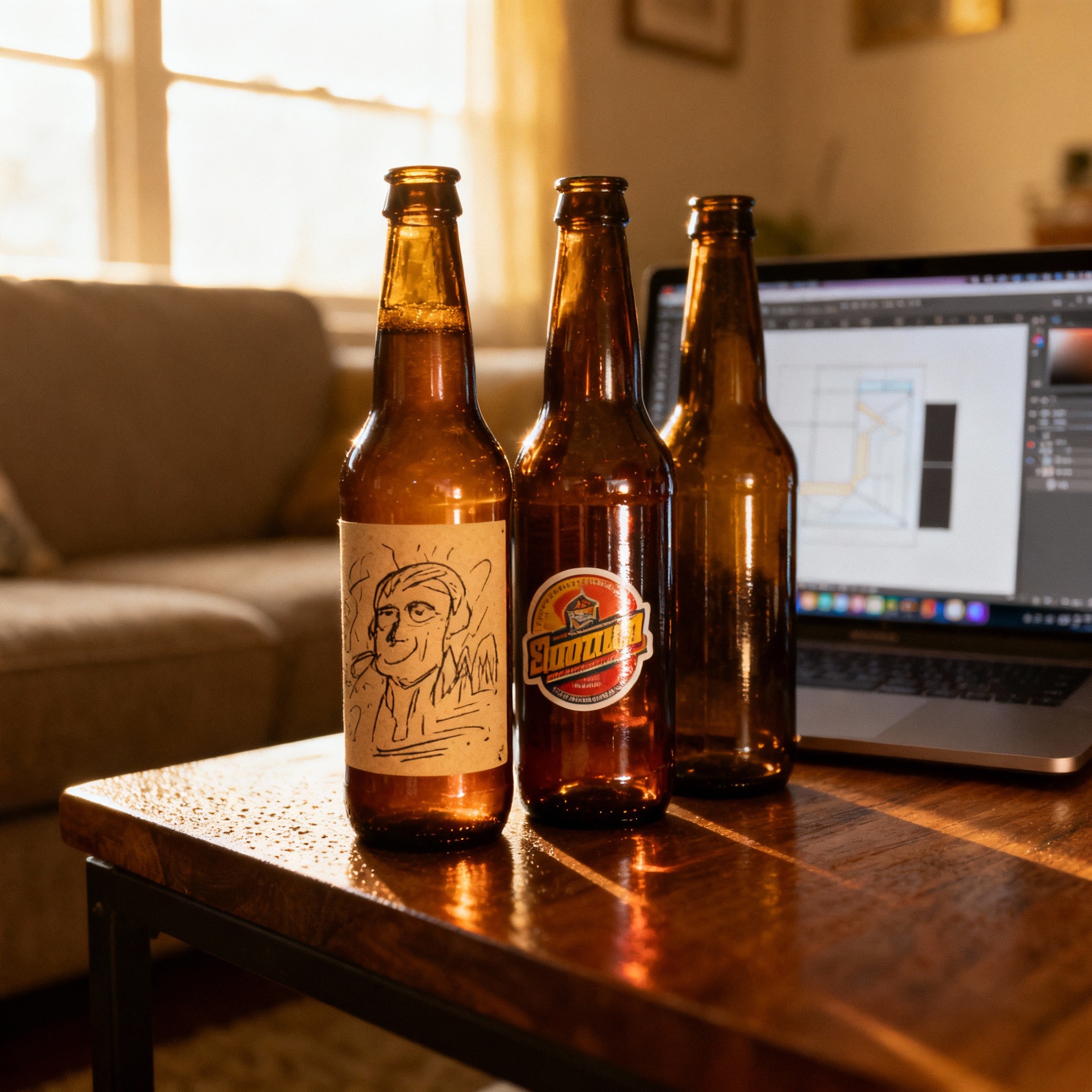
I handed a bottle of my experimental kolsch to a friend last summer. The beer itself was clean, crisp, and exactly what I wanted after three failed batches.
But the label? It was a piece of printer paper taped on with Scotch tape that curled up at the edges after ten minutes in the cooler.
He drank it and liked it, but I could tell he didn’t take it seriously. That moment made me realize something I’d been ignoring for years in the garage lab.
You can nail the pH, time the fermentation perfectly, and carbonate to the exact volume you need, but if the bottle looks sloppy, people assume the beer inside is too. The first sip really is with the eyes.
I’m not saying you need to hire a designer. I’m saying you need to care about the bottle as much as you care about the liquid.
A good label tells the truth about what’s inside in a way that makes someone want to pick it up. This is a design guide, but it’s also a reality check on the rules of the world.
Information Hierarchy: What Needs to Be Big?
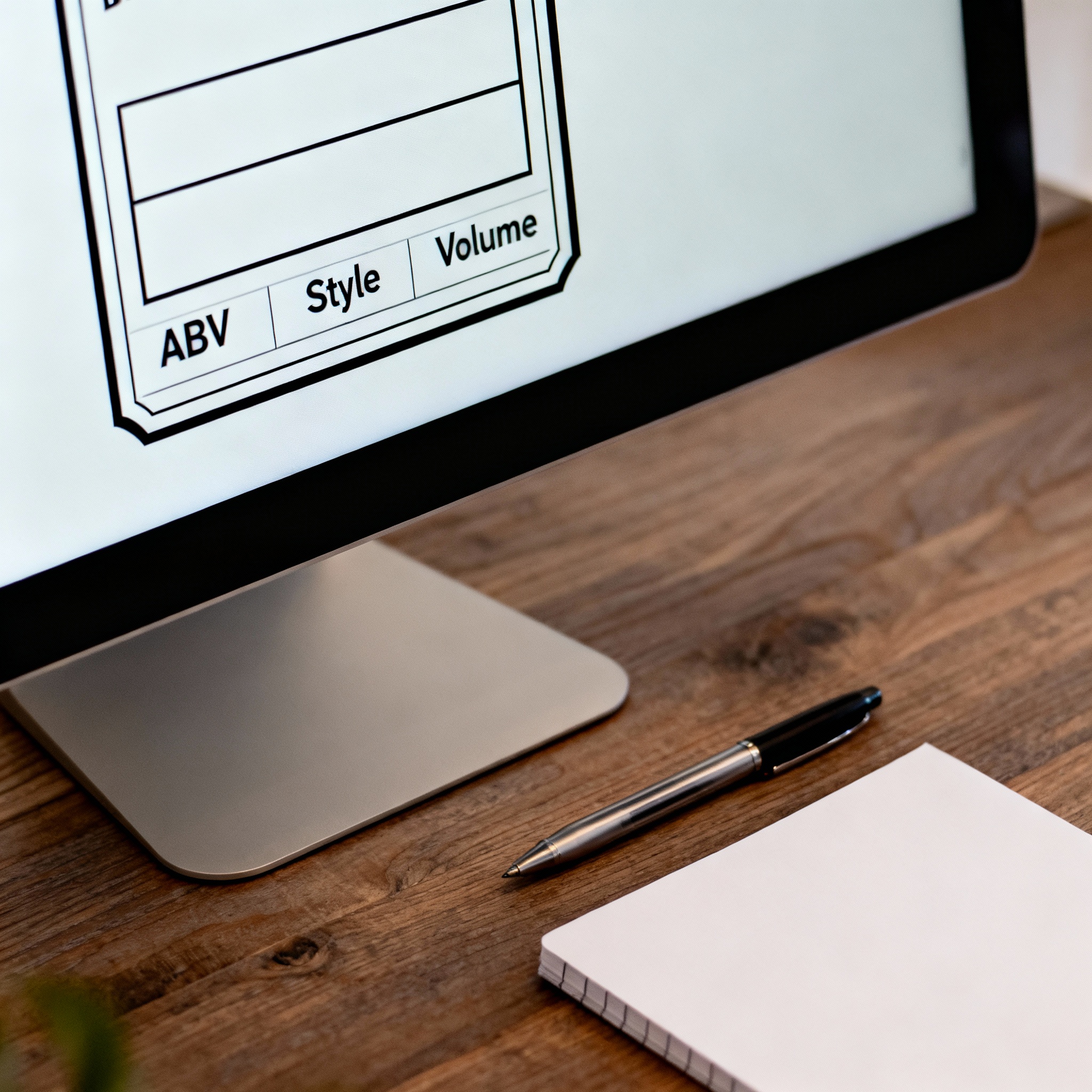
When I look at a label, I want three things immediately: the name of the beer, what kind of beer it is, and how strong it is. Everything else can wait.
Start with the name. This is the biggest text on your label and should be readable from across the room.
I used to make the mistake of shrinking the name to fit in a clever tagline, but nobody cares about taglines if they don’t know what they’re holding. The name is the anchor.
Next is the style. This doesn’t need to be as big as the name, but it needs to be close.
If I see “Hazy IPA” or “Milk Stout” right under the name, I know what I’m getting into. People who know will know, and people who don’t will ask, which is even better.
ABV (alcohol by volume) is third. I put this in a corner or near the bottom, but it’s always visible.
I usually display it as a percentage with one decimal (6.2% ABV). Everything else-ingredients, the story, the batch number-goes on the back or in smaller text.
Print a draft label at actual size and tape it to a bottle. Set it on a table and walk ten feet away. If you can’t read the name and style, the text is too small.
Tools: Pro Results on a Budget
You don’t need Adobe Illustrator; I’ve designed over forty labels in the last two years using Canva. The free version is more than enough for most people.
Canva has templates for everything, including beer labels, which serve as a good starting point. You can set custom dimensions-I usually use 3.5 by 4 inches for standard bottles-choose fonts, and drag in images.
If you want to go deeper, AI image generators like DALL-E or Midjourney can create custom artwork for a few cents. The quality is hit or miss, but it’s a cheap way to get original art without hiring a professional.
Fonts matter more than you think. I stick to two fonts per label: one for the name and one for everything else.
Color choice is personal, but I follow one rule: high contrast between text and background. I once designed a label with gray text on a tan background that nobody could read under bar lighting.
Digital screens typically display at 72 DPI, but printing requires 300 DPI (Dots Per Inch) to avoid pixelation. Always export your final design as a “Print PDF” or a high-resolution PNG to ensure the fine text of your government warning remains legible.
Export your design as a high-resolution PDF (300 DPI minimum). If you send a low-res image to a printer, it’ll come back blurry and pixelated. Trust me, I’ve wasted money on this mistake.
Printing: Waterproof Vinyl vs. Milk-Dipped Paper
Once you have a design, you need to get it onto the bottle. There are two main routes: vinyl stickers and paper labels.
Vinyl stickers are waterproof, oil-resistant, and stick hard. If you’re putting bottles in a cooler full of ice, vinyl won’t peel or smudge.
The downside is that they’re permanent. If you want to reuse your bottles, you’ll spend five minutes scraping off each label with a razor blade.
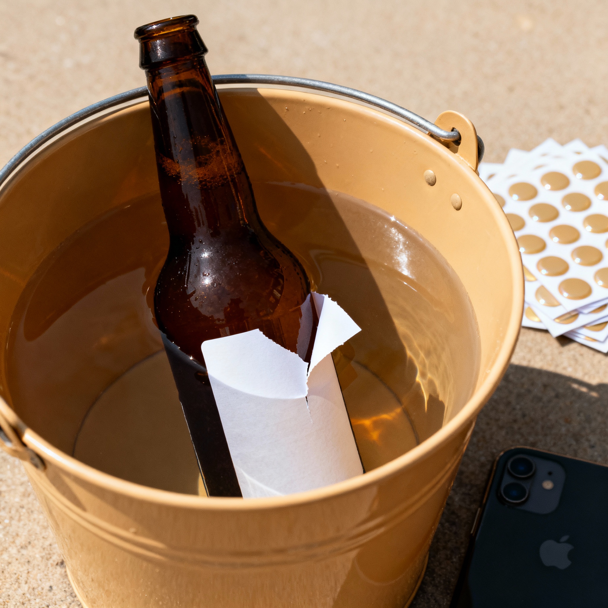
Paper labels are cheaper to print at home and come off easily if you soak the bottle in warm water. However, if the bottle gets wet in a fridge or cooler, the label can curl or fall off entirely.
I’ve also been experimenting with milk-based adhesive. You print your label on regular paper, brush the back with whole milk, and stick it to the bottle.
When it dries, it holds surprisingly well but washes off instantly with warm water. I use vinyl for gifts and milk labels for test batches I drink at home.
Whole milk contains casein, a phosphoprotein that acts as a natural, water-soluble glue. When the water in the milk evaporates, the casein molecules create a mechanical bond with the glass surface that is strong enough for dry storage but dissolves immediately upon rehydration.
If you’re printing at home on paper, run the sheets through the printer twice (flip them and print a second layer over the first). It makes the colors more vibrant and the paper slightly thicker.
Legal: TTB Approval and Government Warnings
This is where it stops being fun and starts being necessary. If you’re homebrewing for friends, you can put whatever you want on a label.
The Alcohol and Tobacco Tax and Trade Bureau (TTB) regulates all alcoholic beverage labels.
Every commercial label must include: the brand name, the type of beer, the ABV, the net contents, the name and address of the brewer, and a specific government warning.
That warning has to be in a specific font size and format. You can’t shrink it or hide it.
Before you sell, you need to submit your design to the TTB for a Certificate of Label Approval (COLA).
If your label violates any rules, like making misleading health claims, they will reject it. If you’re thinking about selling someday, design with compliance in mind from the start.
If you’re designing for future sale, download a TTB-approved label from a commercial brewery and use it as a template. It’ll show you exactly where everything needs to go and what size the text should be.
Branding: Creating a Consistent House Look
If every label looks totally different, your collection looks like it came from five different breweries. To make your work recognizable, you need a house style.
I learned this after designing fifteen labels that were all over the place. Now, I use one font for names, one for secondary text, and a consistent palette of four colors.
The artwork changes for each batch, but the structure remains the same. This makes your lineup look professional and familiar to your drinkers.
The easiest way to do this is to make a template. Duplicate your best design and just swap the name, style, and ABV for each new batch.
Some brewers add a recurring graphic element, like a small logo in the corner. Find a style that matches your personality and stick with it.
Create a one-page brand guide for yourself. Write down your fonts, colors, and layout rules. Save it in the same folder as your label templates so you don’t have to remember what you used last time.
Conclusion
A good label doesn’t make bad beer taste better, but a bad label makes good beer forgettable. I used to think the label was just decoration, but it’s actually the first promise you make to the person holding the bottle.
You don’t need expensive software to look professional. You just need a clear hierarchy, a simple layout, and the discipline to follow the rules of design and regulation.
The best part of this process is that it forces you to understand what makes each batch unique. When someone picks up your bottle because the label caught their eye, you’ve already won half the battle.
References
- Alcohol and Tobacco Tax and Trade Bureau. “Beverage Alcohol Manual.” U.S. Department of the Treasury.
- Canva Design School. “Label Design Basics.” Canva.com.
- American Homebrewers Association. “Labeling Homebrewed Beer.”
- Sticker Mule. “Vinyl vs. Paper Label Specifications.” stickermule.com.